Heatmap for polygons: visualise overlaps in a large polygon dataset
The problem
You are working with a dataset of 48,000 polygons representing map sheets created by the Ordnance Survey (OS), Britain’s national mapping agency. The data (created by the National Library of Scotland) describes historical map sheets created over the course of more than a hundred years. Some polygons are direct overlaps, some are offset.
Where are the locations with the greatest number of sheets through time? Or, to put it another way, where do the polygons most overlap? Generalised, the same problem could apply to polygons data describing other things – for example where we find particular animal species, or pathogens. In this blog post I describe how to make a heatmap showing where there are most overlaps, in JavaScript. This approach uses WebGL shaders via the PIXI.js library.
Background
A straightforward method is plot everything, giving the polygons some transparency and look for the darkest areas. This works fairly well, but it can be quite difficult with the naked eye to distinguish between small changes in opacity. The dark colour all looks pretty similar where there are lots of overlaps.
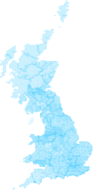
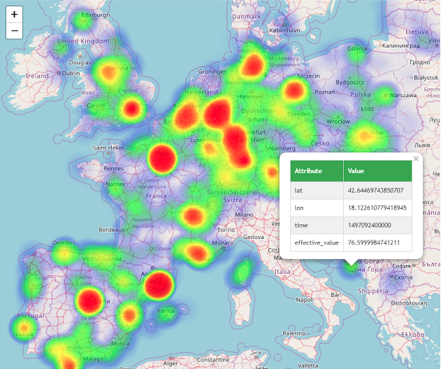
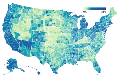
Ideally we’d adjust the colours (or, more particularly, the hues) to make these differences easier to see. This is the idea behind a heat map: hue represents value. We’ve all seen these before, either for points data (see left)—the blurry, nebulous effect where the ‘hot’ areas have the highest density of points— or for defined regions (see right), known as a choropleth.
Can we do this for polygon overlaps? Our case is like the second example, except we don’t have the ‘correct’ polygons yet. To make a map like example two we would need to transform our dataset into a new set of polygons representing the areas of union (overlap) and get the overlap count for each of these. We could use a GIS (Geographic Information System) method to transform the original dataset. See: https://pro.arcgis.com/en/pro-app/tool-reference/analysis/count-overlapping-features.htm and https://www.esri.com/arcgis-blog/products/arcgis-desktop/analytics/more-adventures-in-overlay-counting-overlapping-polygons-with-spaghetti-and-meatballs/. But this seems heavy-handed here, especially if we’re more interested in creating a visual than getting a list back of, eg., the top ten locations with the greatest overlaps.
(This is especially the case with this data because some of the overlaps in our dataset are ‘false’. There appears to be lots of overlap at county boundaries. This is actually just an artefact of the Ordnance Survey creating discrete sets of map sheets for individual counties in the past. This sheet is an example; the blank section at the top is not the sea, that’s just the next county over. Having a visual that we can judge with this in mind is, therefore, very useful. This is good illustration of why visualisation is very helpful working with humanities data; we often deal with these kinds of complications which are simpler to handle using human interpretation, rather than attempting to code something into a computer program to take this into account.)
Colourising alpha with shaders
As an alternative approach, I took inspiration from how Mapbox create what they call a ‘poor-man’s heatmap’ by “colorizing-alpha” (alpha meaning transparency). It’s a simple idea. If you draw all the polygons semi-transparently on top of each other, the resulting opacity at any point is the measure of overlaps. Even if you can’t distinguish this very well with your eyes, your computer can. If you access the pixel values of this raster image computationally, you can simply re-colour the image—without having to do any GIS processing—by applying a colour scale to the opacity at any point. The Mapbox implementation is for points data, but it’s straightforward to adapt the technique to polygons.
How can we access the raster pixel values? I was already working in a web environment, drawing the polygons using WebGL (high-performance interactive graphics with GPU acceleration for web browsers) via the PIXI.js library to get better performance for this volume of data. If you’re working in WebGL, you can use a shader: programs that run on every single pixel of your visual in parallel on the GPU (so they’re really fast – enjoy this video using paint balls to make pictures to illustrate what’s going on). There are two shader types: fragment shaders and vertex shaders. We’re only interested in fragment shaders here; they access and change the colour of pixels– ideal for this task.
I was initially reluctant to try shaders as they are written in C-like code language I hadn’t used before: GLSL. But it was such a simple operation I decided to give it a go and, in the end, it wasn’t too painful! I return below to the resources I found most helpful.
If instead you were working in Python, after creating an initial raster image, you could use an image manipulation library like Pillow to do the same thing.
PIXI.js is a lightweight library for creating WebGL graphics. In PIXI, shaders are called filters. There are some pre-existing filters available, but you can also write your own which is what I did. I found these resources the most helpful:
- https://www.awwwards.com/a-gentle-introduction-to-shaders-with-pixi-js.html covered almost everything I needed. Also points to this https://www.shaderific.com/glsl/ reference site for GLSL.
- The Book of Shaders a work-in-progress resource, but still helpful
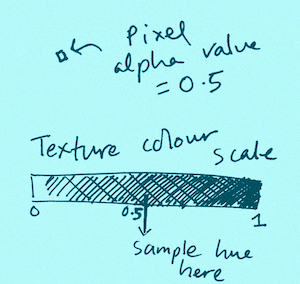
The shader is a standalone program running on the GPU. How do we give it the heatmap colour scale we want to apply? Poking around in the Mapbox GL shader code they solve this elegantly by creating a texture (a WebGL-ready image) of the colour scale itself, running horizontally, and pass that (as a ‘uniform’) to the shader. To map between a given alpha value and the hue to replace it with, you sample hues along the texture. If the alpha value, for example, is 0.5, the hue this corresponds to is whatever hue is 50% along the colour-scale texture.
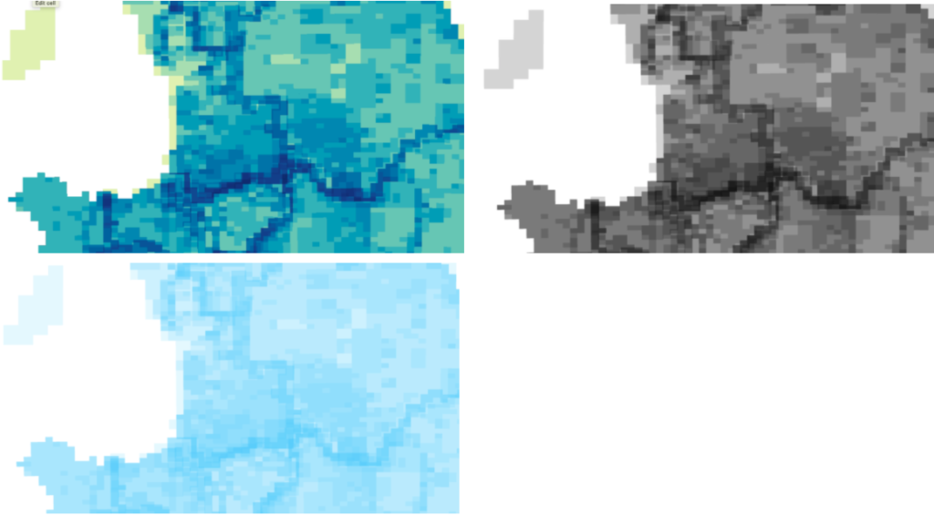
You can judge for yourself the success of this method by comparing the results below. I’ve used d3.interpolateYlGnBu as the colour scale, but you can use whatever you want. The middle example shows the option of applying the ‘multiply’ blendmode which also makes it easier to judge the overlaps.
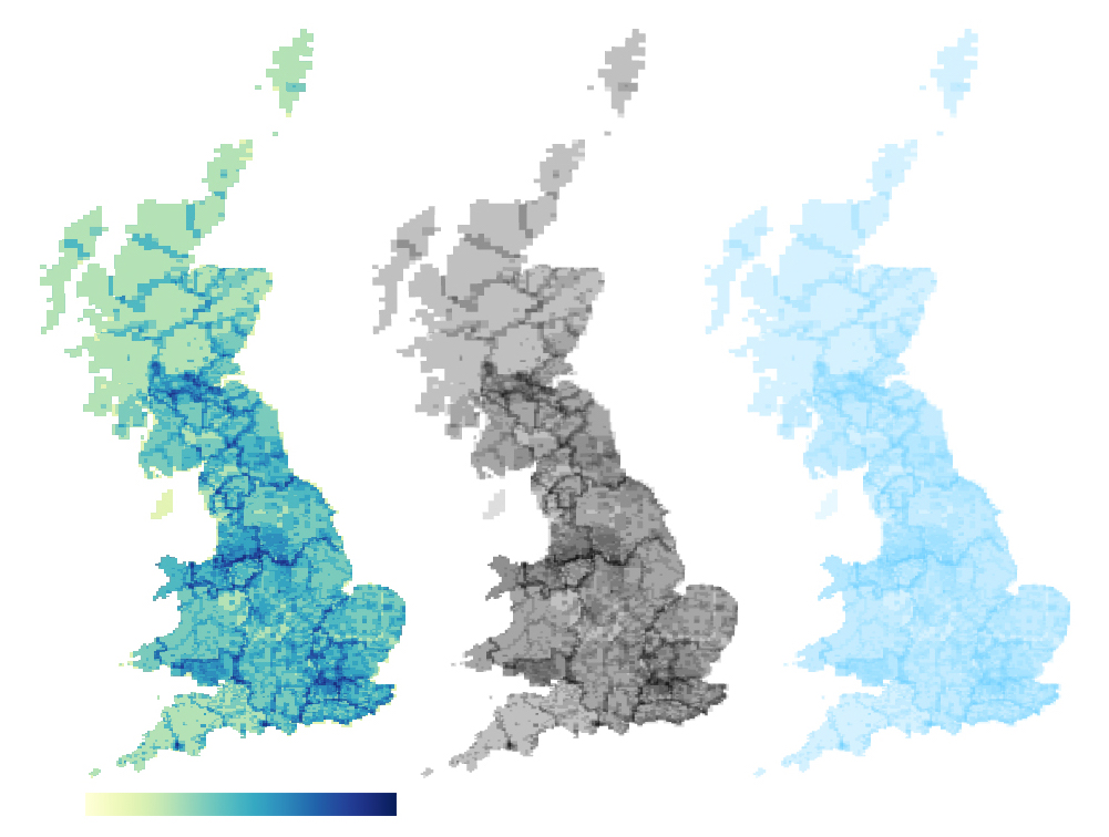
Left: heat map. Middle: ‘Multiply blendmode’. Right: semi-transparent polygons
Have a look at the code for creating this heatmap in this Observable notebook: https://observablehq.com/@oliviafvane/heatmap-for-polygons
Learning PIXI.js resources
- A good guide to getting started with PIXI (written for a games design audience, but still helpful for dataviz work): https://github.com/kittykatattack/learningPixi
- Various basic PIXI examples (in version 4 and 5): https://pixijs.io/examples-v4/#/demos-basic/container.js
- Data-viz-geared PIXI implementations on Observable: https://observablehq.com/search?query=PIXI
Latest posts from us


