LwM Digital Residency: Visualising the Press Directories dataset
My initial proposal to the Living with Machines team was to develop an interactive, open-source web app visualising data from the Press Directories dataset alongside general election results. With this project I had two main goals. Firstly, I wanted to provide a user-friendly and immediate way for scholars to explore the Press Directories dataset, which is a valuable resource but might look daunting to those less used to working with large historical datasets. Secondly, I wanted to enrich and expand upon the resources I used, as well as making my own code open-source and reusable, hopefully simplifying the task of future researchers.
The process in a few steps
- I collected relevant datasets:
- The Press Directories dataset, a representation of the Mitchell Press Directories. This was an almost yearly (between 1846 and 1922 in this case) publication that listed all UK newspapers with some key information about them. Most relevant to this, it listed political affiliations and areas of diffusion.
- The CLEA elections archive, containing electoral results from all over the world in the last two centuries.
- The Historic County Borders Project, a GeoJSON map of UK’s historic counties.
- I used Python to clean up all the data and create three-way matches between the map and the press and electoral data. I then exported JSON files that collected the matched data.
- Using Javascript and the JSON files, I created an interactive web-app for people to explore the two datasets.
You can find all the code for the web app and the cleaning process on this GitHub repository.
The main challenges I faced
As it often happens, the initial proposal had to come to terms with the realities of available data. While this didn’t force me to change the final planned output significantly, it did present some challenges which I listed below. For a more thorough discussion of them, as well as ways in which I addressed them, you can read my final report. If you care about pre-processing and data cleaning, that report also contains Jupyter notebooks documenting that whole ordeal.
Putting press and elections on the map
The first issue was finding a relevant and understandable way to map the Press Directories dataset while keeping consistent with electoral results, which are based on a myriad of constituencies. Ultimately, I decided to use UK’s historic counties.
Using colour to illustrate political leanings
Political leanings of newspapers and historical parties are a complex and messy bunch. To simplify the presentation of the data, I used a unified color scheme for press and electoral data for each county.
This way, users can get a bird’s eye view of the whole county, seeing colour coded majorities for each county (of either elected MPs or press leanings), and each county’s specific pie charts use the same consistent colour scheme.
Data cleanup and implementation
Due to the complexity of pre-processing tasks, especially with regard to the electoral datasets, I abandoned the initial plan for a full Python stack and switched to a hybrid approach using Python-based preprocessing and live visualisation with JavaScript based on JSON files. This combination does involve a two-step process to be set up, but it’s well worth it for the performance and usability gains.
What I learned from this project
Newspapers grew more and more independent (at least on paper!)
During the decades spanned by the Press Directories dataset more and more newspapers came to be listed as “independent” all over the country. This picture shows what the country looked like in 1846 (left) and in 1922 (right), when many counties had a majority of “independent” newspapers.
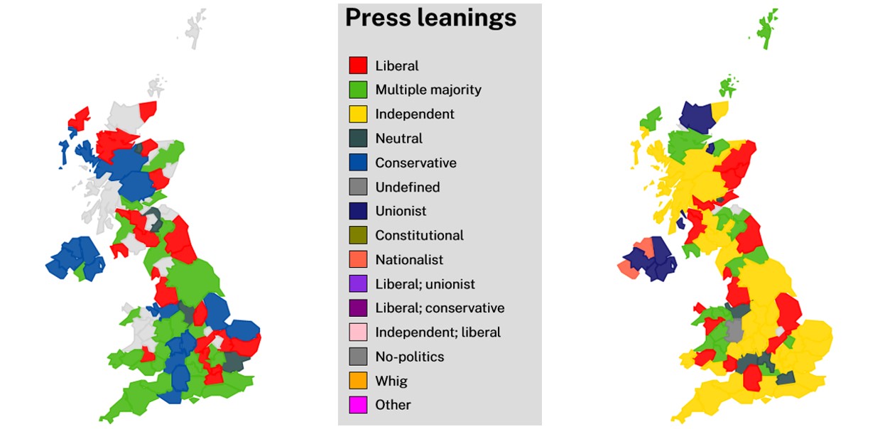
Given this shift, it would be important to further investigate the use of the “independent” label in Mitchell’s original work, to understand why they considered so many newspapers independent and what that meant for the people who read them.
A good matching strategy is a mixed strategy
One of the most time-consuming parts of this project was cleaning up datasets and connecting them with other relevant ones. To make it faster, I used a combination of manual matching, fuzzy-matching and geocoding. The data cleanup was still challenging, but these techniques were really helpful. I hope my efforts will improve the quality of the resources I used and make it easier for future researchers.
(Open) electoral boundaries are a rare commodity
The lack of open and accessible electoral boundary data was a major obstacle in this project. It is unfortunate that relevant datasets are often private and not readily available to researchers. Open data would not only benefit this project, but also countless other research endeavors. In my case, I had to adopt alternative strategies to make up for this. Hopefully, in the future, we will see a greater emphasis on the importance of open data and more initiatives to make it a reality.
What I couldn’t do (and what could be done)
The project had a short turnaround schedule and a clear scope, which made it easy to produce the final output while keeping track of potential improvements. Here are some suggestions for those who want to expand on this project or create a similar one:
- Look into press categorisation, particularly the label and concept of “independent” press, which has become more prevalent over time.
- Improve the quality of electoral data, starting with a better cleaning process, which is not without flaws.
- Address the issue of hard-to-find boundary data, especially in Scotland and in the early 20th century when many constituencies were merged.
- Consider refining the colour schemes used for political leanings to better align with political parties and seek expert supervision from those more familiar with historical political ideologies and parties.
Conclusions
This project has been a great learning experience for me, and I am proud of the work I have accomplished. I am excited to see what further impact my efforts will have, and if you are reading this and thinking about embarking in a similar project (or extending this one) feel free to reach out to me at nbonato.com.
Finally, I would like to thank the Living with Machines and Turing Institute staff who were always available for requests and clarifications.
Latest posts from us


