Macromap: Interactive Maps in Time
In this blogpost we introduce ‘Macromap’: an interactive ‘small multiples’ visualisation for historical map collections. How can we get a handle on very large, partially-digitised collections of maps? We need a map of the maps.
Macromap is designed to help researchers understand what map sheets the British Ordnance Survey (OS) made, when and where. It also illuminates what’s been digitised: a lot, but not everything. The interface could alternatively be used with other historical maps and map series metadata, and, more generally, to understand the geographic and temporal shape of large-scale polygon datasets.
The OS, Britain’s national mapping agency, created large numbers of detailed maps from the early nineteenth century. Map series at different cartographic scales, in a sequence of editions, capture snapshots of a changing landscape through time. Macromap visualises data describing these maps, helping us see what is available.
Macromap is one of a set of visualisations we have made for understanding historical map collections and their history. Watch our presentation ‘Maps in Time’ from Information+ Conference 2021 to learn more.
Early Ordnance Survey Maps
OS maps are an amazing resource with a complex surveying, engraving, and printing history that map historians have long grappled with. In Living with Machines, a research project looking at industrialisation in nineteenth-century Britain, we use these maps to trace the development of railway infrastructure, and the transformation of communities as towns and cities swelled with new development. Doing this kind of visual analysis computationally, we can look for very detailed, high-resolution patterns at a nationwide scale. (Read more about our work applying computer vision to these maps in these posts: Catching up with maps and New Article: Maps of a Nation).
The task of a national mapping agency is to create up-to-date maps. As the British landscape changed, the OS had to try and keep pace. A sequence of updated editions was created over time. But a single edition wasn’t created instantaneously, as we can see in the animated image below. And individual sheets were sometimes revised within an edition (these are known as ‘states’).
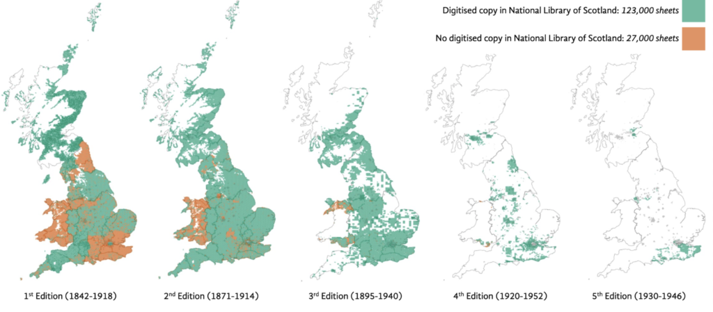
Added into the mix, while a lot has been digitised, not everything has. Below you can see digitised regions in green and undigitised regions in orange for the 25 inch to the mile series. Note these undigitised regions are a mix of whole counties, and isolated sheets, which makes it all the more complicated to assess when viewed at this national scale.
Index Maps
In Living with Machines, we are working in particular with a large dataset of historical OS maps (~200,000 sheets) digitised by National Library of Scotland (NLS). These come from a number of different series maps at different cartographic scales: 1 inch to the mile, 6 inch to the mile, and 25 inch to the mile. A series map represents a larger geographic area divided and printed on multiple sheets representing portions of that area. (Macromap features OS maps of Great Britain. But the OS also created maps of Ireland in this period. These do not feature in Macromap because they are not included in NLS’s data. OS history in Ireland is the subject of a new research project: OS200 ‘Digitally Re-Mapping Ireland’s Ordnance Survey Heritage’).
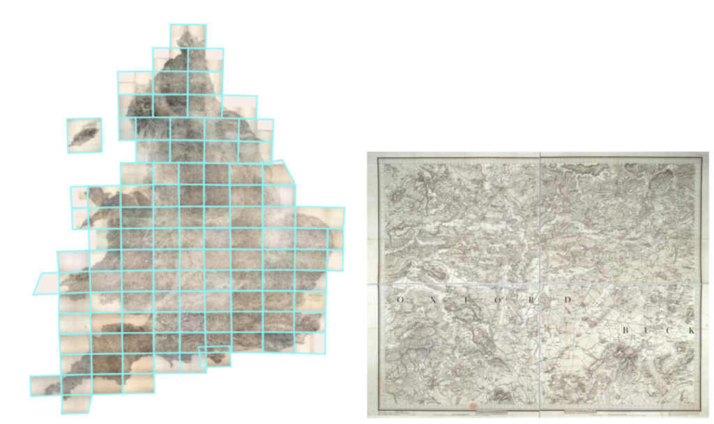
In order to help sell maps, a composite, or index, of the series was printed at a smaller scale to help map users find one sheet within the whole (see image below).
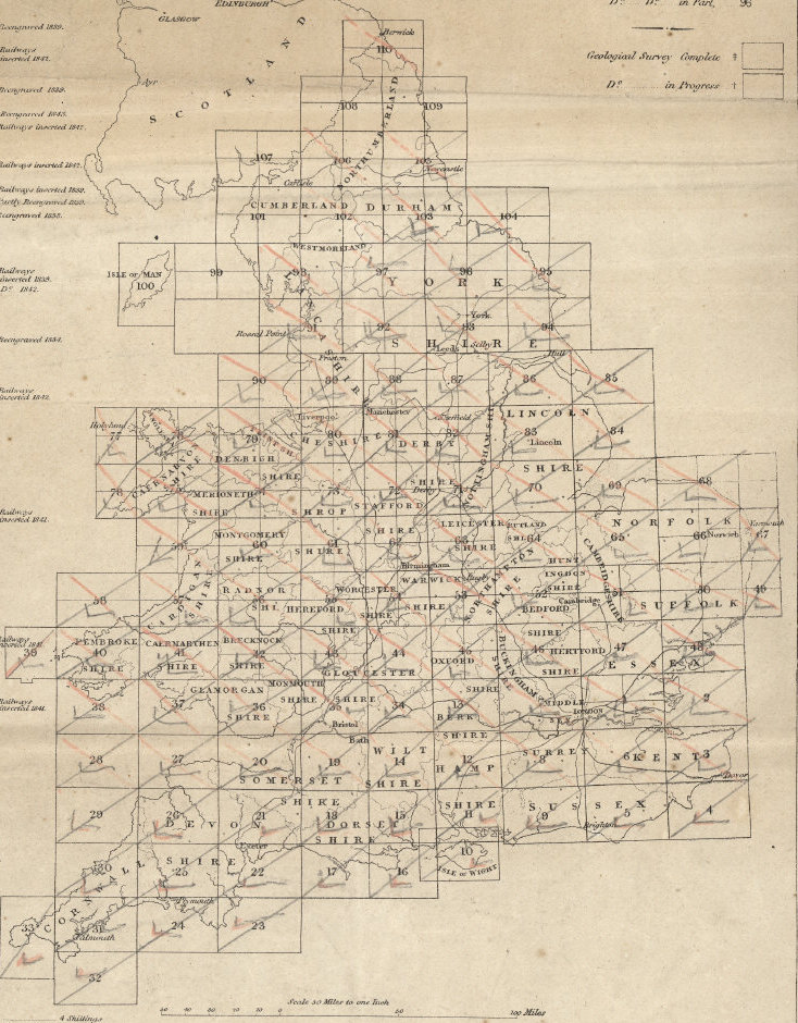
When digitised, individual sheets can be ‘stitched’ together to create a seamless digital composite; see below a digital composite for the ‘Old Series’ sheets. These digital composites are visually similar to the index above, even though the physical originals would have rarely, if ever, been pieced together at a national scale. Sheets were sold bound up in volumes and, even with loose sheets, laying out the jigsaw of, e.g., the six inch to the mile series sheets would stretch the area of a football pitch. Just like the original index maps, these digital indices (the digital imagery and data that describes each sheet’s spatial extent) are a useful tool for understanding the relationship of individual sheets to the larger county or nation, and to their surrounding sheets.
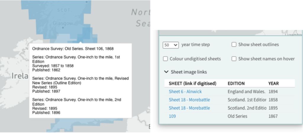
With digital technologies, interactivity can extend these graphic devices to help support retrieval. National Library of Scotland, for example, offers clickable indexes on their website, see https://maps.nls.uk/geo/find/. It is also possible to dynamically filter these indexes by the date of the map (see further details) and the related Map Finder – with Marker Pin viewer visualises the same metadata and bounding boxes too for individual sheets. In Living with Machines we previously shared a heatmap visualisation for assessing where are the places with the greatest numbers of map sheets describing them.
In the language of cartography, then, we might call Macromap an interactive index map. Macromap allows researchers not only to find one map, but to search across time and space using the periods and areas of interest to a specific topic.
Small Multiples
Macromap introduces time to the index map using a small multiples approach. The term ‘small multiples’ was introduced by Edward Tufte in his 1990 book ‘Envisioning information’. It means multiple small representations of the visualisation side by side, each showing a different view on or subset of the data (eg. time steps, or divided by category). Because all the data is displayed simultaneously, it is easy to make direct visual comparisons. We don’t have to try and hold an image in our head from a changing graphic—animated or adjusted with controls—, to compare with the current view. All the data is on view at once.
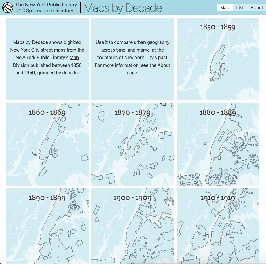
The New York Public Library’s ‘Maps by Decade’ (code), for example, similarly uses a small multiples approach to show the coverage through time of their New York City street maps, but is hard-coded in how time is broken up and one can’t zoom over the maps.
These digital tools, now including Macromap, are an extension of the same thinking behind the physical index map. Going digital means we can inject time and allow more flexible spatial comparison. By mapping the maps, we can better understand how they relate to each other, and what the collection looks like in aggregate.
Macromap
If we want to work with maps as data at scale, we need to understand the data’s shape in space and time: which maps are available, and when were they created? We may be interested in a city, a region, or a whole country. Pulling together all the different maps—different scales, different times, digitised or not—for any particular place manually is very time consuming. If we want to do this repeatedly, or for any arbitrary area, we have to turn to computational methods.
Macromap is designed to do exactly this—to get a sense of the complex temporality of these maps and to understand what’s available, supporting hypothesis generation and analysis in research.
Tool Design
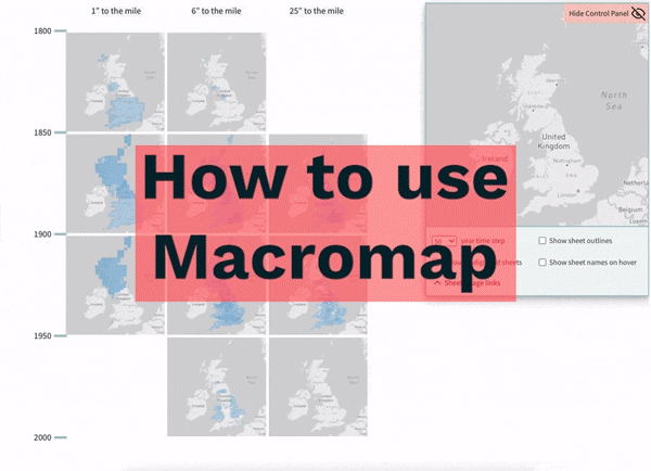
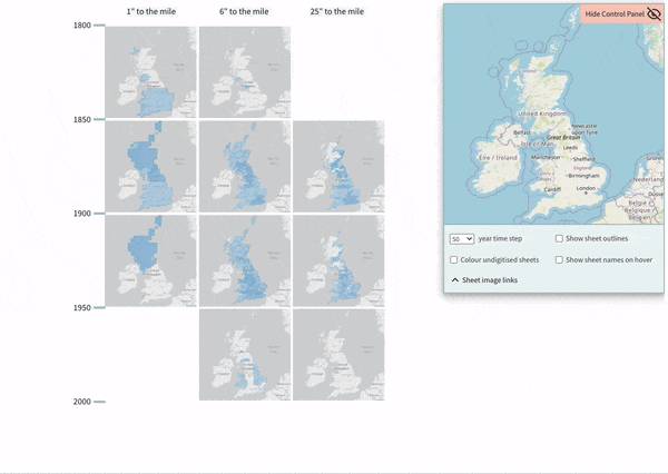
Macromap has a ‘small multiples’ design. Multiple miniature maps, arranged in a grid, are used to split the data by time (organised vertically) and map series (horizontally). By showing all the data at once, it is easy to compare and get an overview across these different dimensions.
The vertical time step can be adjusted to 50, 20, 10, or 5 years. Map sheets are drawn on the miniature maps in a solid colour with a slight transparency so we can see if there are multiple sheets overlapping within the same time window.
To move the miniature maps, you pan and zoom the control panel’s map, in the top right of the interface: all of the windows are chained together such that panning and zooming in that control map moves all the miniatures in synchrony. By adjusting the spatial window on view, we can focus on any area of interest and visualise the maps data, across series and through time, for that area. Each miniature map visualisation has a modern base map beneath so we can understand the geographic context. The canvas on which the small multiples are drawn can itself be zoomed and panned.
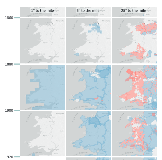
From all of Great Britain, we can zoom in, for example, to just Wales, and from there zoom in to just one town. We can toggle drawing the individual sheet boundaries; this is an option in the control panel. (Beware: drawing the sheet boundaries at low zoom levels can create moiré patterns, caused by rendering the very tight grid via the pixel grid of our computer screen). At each zoom level, we can see what the coverage is through time: when and where. A further option (‘Colour un-digitised sheets’) in the control panel highlights which sheets are un-digitised, colouring them red.
Crucially, we can get back to the metadata for the individual sheets. The control panel has an option, “Show sheet names on hover”, to turn on a tooltip (message revealed when hovering over a sheet with your cursor). There is a separate dropdown, ‘Sheet image links’, revealing a table with links to the map sheet images (if digitised). The table is populated with records by clicking within the interface.
Sheet-level Metadata
A key element that makes this interface possible is access to sheet-level (or item-level) metadata. In fact, being able to do data visualisation or other data science work with these OS maps (and other similar series map collections) has only recently become possible. This is thanks to the map-holding libraries creating sheet-level metadata when they digitise the maps. The traditional approach in libraries has been to create one catalogue record at the series level. Item-level metadata is transformative for doing computational work with digitised map collections.
For these map series the metadata was created by National Library of Scotland, with the exception of the earliest ‘Old Series’ sheets, where the metadata comes from the Charles Close Society. NLS does not hold a copy of every sheet that the OS made. But very helpfully, the metadata they created includes inferred records (an ‘abstract archive’) for the sheets they do not hold but have inferred based on the existence of later ones. This is highly useful as it allows us to consider the shape of the potential complete collection in this visualisation, digitised or not.
On Time in Historical OS Maps
Macromap positions map sheets at a single year, but this is a simplification of the ‘when’ these OS maps represent—leaning on dates available in library metadata about the earliest possible survey, print, and revision dates for a given sheet. There can also be ambiguity for the earlier OS sheets, where sheets were sometimes partially revised (e.g. railway lines were added, but buildings were not updated), and the dates printed on the sheet were not updated. For more information, see ‘Interpreting survey and revision dates’ and ‘“Railway” additions and related variant states’, National Library of Scotland.
What does it show?
Visualising the OS metadata in Macromap gives us a view onto what maps are available, which is important for framing questions, guiding analysis, and interpreting results in research. We step through an example below scoping coverage for a place. But the tool also highlights patterns in OS mapmaking history, which we describe in the section after.
Scoping map coverage across an area
As a simple example, Living with Machines is planning an exhibition with Leeds Museums and Galleries. What early OS maps exist, and are digitised, that show the changing urban landscape in Leeds and the (now) wider metropolitan area?
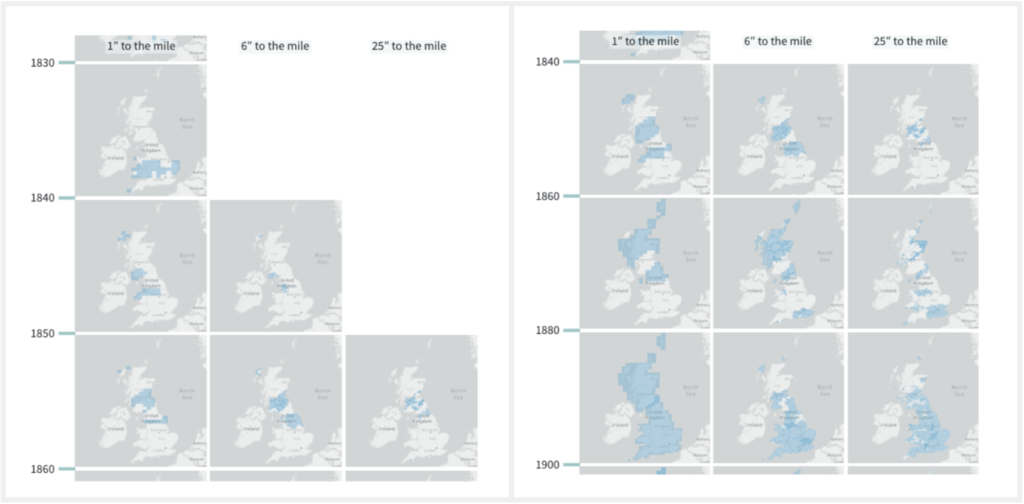
Using Macromap, we can first take a wide view over Leeds and the surrounding area. By adjusting the vertical scale to 20 year steps, we can easily see that the earliest sheets created by the OS were surveyed in the late 1840s and published in the early 1850s. We observe that the earliest 1-inch-to-the-mile maps (the ‘Old Series’) are accompanied by contemporaneous, more-detailed 6-inch-to-the-mile maps. As a northern city, Leeds is included in the earliest set of counties surveyed at six-inch-to-the-mile maps by the OS.
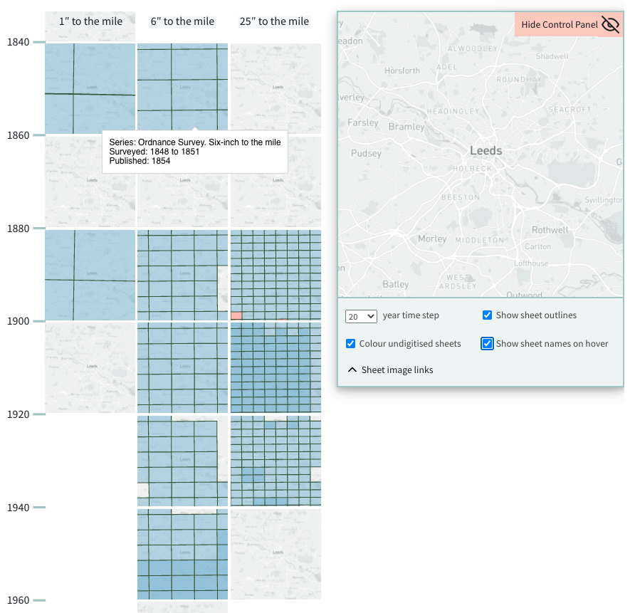
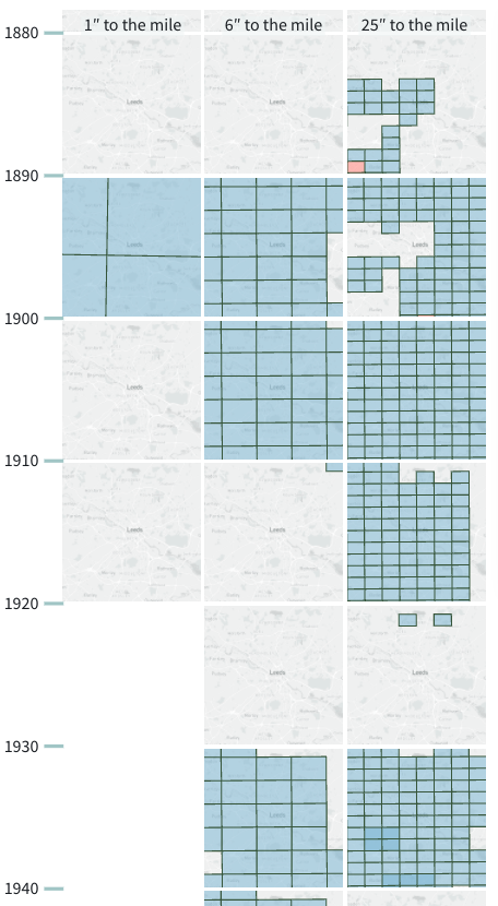
Pulling the data further apart temporally, adjusting to a 10 year time step, we see the next set of maps— at both 6 and 25 -inches to the mile—date from around 1890. We can see that the survey dates for the centre of Leeds are just a little earlier than the surroundings. There are additional sets of maps at timepoints around 1905-10, and 1920, but not at all scales.
To check whether sheets are digitised, we can turn on the ‘Colour undigitised sheets’ option in the control panel. Fortunately, all these sheets have already been digitised (save for a very small number of 25” sheets visible in red at the south west edges of these windows).
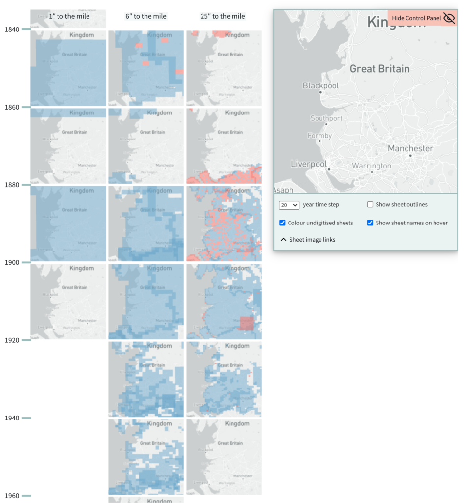
We can scope coverage, dates and digitisation status, with the same operation, for a whole county. If we consider the pattern of coverage, for example, across Lancashire—see below—, the situation is a little more complicated. (The overlapping sheets, visible with the darker blue, around the edges of Lancashire seem to represent duplicate coverage. For several decades, the OS prepared discrete sets of maps for each county, known as ‘County Series’ sets, where sheets at county borders were re-printed for each county, so these are not true duplicates). We’ll return to this display for Lancashire in the next section on interpreting the patterns of OS mapmaking
General patterns of OS mapmaking
While the motivation for this tool is to help researchers understand the shape of this data, Macromap inevitably also highlights the general pattern of OS mapmaking for these series. Much has already been written about the history of the OS (for example, see the publications of the Charles Close Society), so these patterns are not new discoveries. But viewing the data this way does draw attention to them and may help computational researchers coming to this collection for the first time.
Macromap shows the 1-inch series gets started earliest, followed by the 6-inch and then the 25-inch. The patterns of survey through time roughly match across all the three series; after its early years, the OS surveyed at a ‘base scale’ and based maps at different cartographic scales on the same surveying.
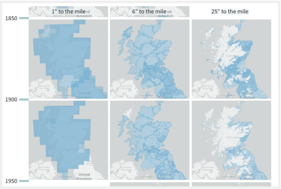
We can see that the most detailed 25-inch maps were never made for the more remote, mountainous or moorland areas in Britain. It was viewed as a poor use of resources. In the image below, we see that large areas of remote Scotland were not mapped at this scale.
From the boundary patterns that form from overlapping sheets we continue to see that the 6-inch maps were created as discrete county sets. And the 25-inch maps were initially created as discrete parish sets and later switched to county sets.
Macromap highlights the sequence of editions. After 1893, the OS aimed to remap the entire country (in a new edition) every twenty years. But from the First World War, the cost of this was too great, so urban places and other areas undergoing the most change were prioritised.
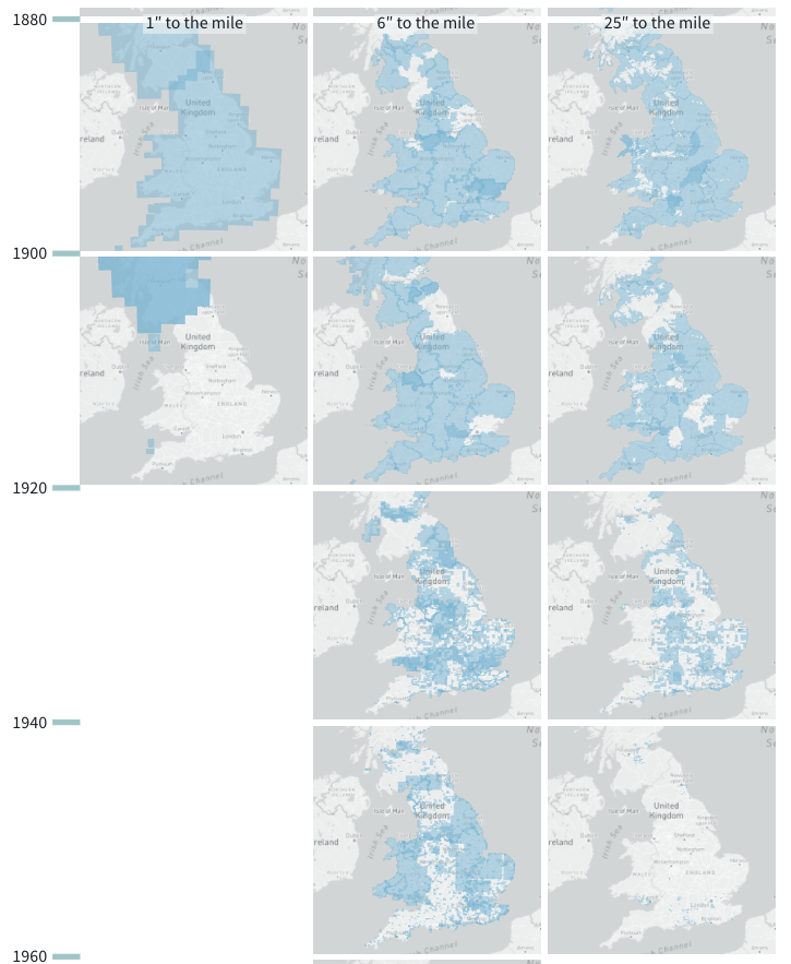
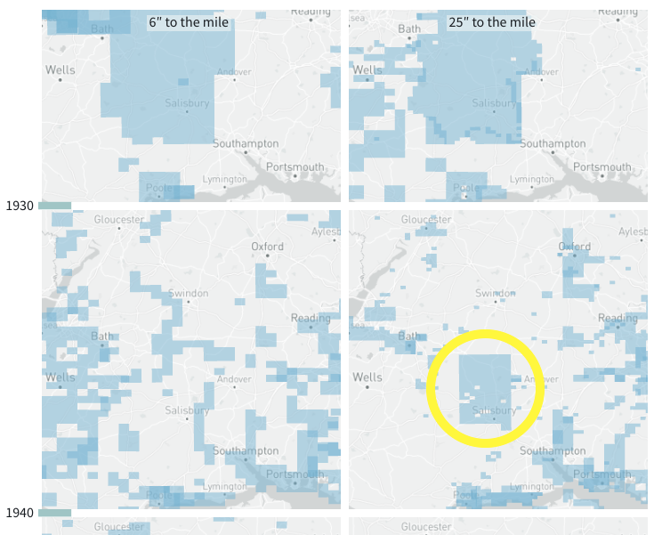
Leading up to the Second World War, in the late 1930s, many urban areas were re-surveyed for Air Raid Precaution purposes. We can see this in Macromap; the new maps for this period cluster over towns and cities. Similarly, we can see a square of freshly revised 25-inch maps from the late 1930s covering Salisbury Plain, which was used as a military training area.
Interpretation of patterns should be approached with some caution, though, keeping in mind what the metadata does and does not include. Returning to the visualised data for Lancashire, below, this display seems to suggest little surveying activity in Lancashire 1940-60. In fact this is because these County Series had ceased and work was active, instead, especially in areas like Lancashire, on the new OS National Grid survey. At the time of writing, the National Grid survey is not included in Macromap. Similarly, the image below does not show any 25-inch survey in Lancashire pre-1880, when in fact small areas do exist. These are absent from the visualised metadata because they are not acknowledged on the later resurveyed sheets (and therefore are not picked up in the method NLS uses to infer metadata for sheets not in their holdings). Full OS catalogues, such as this one from 1894, are a helpful reference in cases like this.
Visualise Map Data
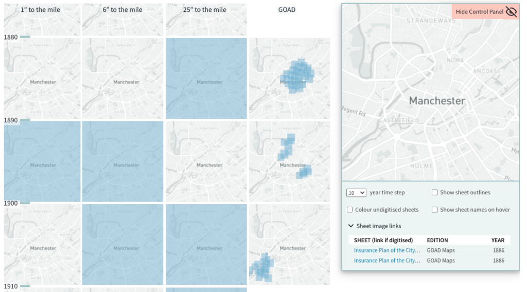
While we have looked at OS data here, Macromap can be used to visualise any other series maps with item-level metadata (or, actually, any polygon datasets with a year dimension) in GeoJSON format. The image below compares coverage with another set of detailed maps of nineteenth-century Britain: Goad fire insurance maps.
NLS is currently working on adding the OS Town Plans of England and Wales (1840s-1880s) at 1:500 scale to their website, which will be a useful addition in the tool.
Use Macromap
For information about how to import your data into Macromap and the expected data structure see here. The Macromap code is published in an Observable notebook and is open source licensed. Dig into the code notebook for more technical details.
Credits and Thanks
Macromap was created in the Living with Machines project at The British Library and The Alan Turing Institute. Design and code by Olivia Vane; ideas and writing developed with Katherine McDonough.
We would like to thank Chris Fleet (Map Curator, NLS) and The National Library of Scotland Map Room team for sharing this maps data. NLS’s metadata creation for the OS maps in their collection forms the essential basis for Macromap. We also thank The Charles Close Society for the Study of Ordnance Survey Maps for sharing metadata describing the OS ‘Old Series’. We thank both for their generous help.
Latest posts from us


